
Ranking the 2022 Formula 1 Liveries
March 21, 2022
Introduction
This year, Formula 1 has implemented a new set of aerodynamic regulations for the sport. This has led to varying design philosophies for each of the cars. The different designs of the shapes of the cars have played a role in dictating the way the livery designers design their liveries. I will be ranking only the liveries that are running for at least the majority of the season, which means I will be excluding Alfa Romeo’s camo livery, Alpine’s predominantly pink livery, and the Haas liveries seen at testing in Spain.
10th: McLaren: 4/10
McLaren were one of the first teams to reveal their livery for this season. They introduced a design where they used their standard base papaya orange, and a secondary color of Gulf blue. I was not impressed by this livery. They made a slight adjustment to the livery for the second week of testing in Bahrain, however it doesn’t look any better. The number font is strange, and the number is difficult to read because they chose to put the light Gulf blue against the not much darker orange. There’s a little bit of black, which looks okay. The approach is also a bit unsettling to me because they put an angular design on a curvy car.
9th: Haas F1: 5.5/10
The Haas livery is a bit bland, however they don’t have too many sponsors, especially after recent controversy. They released a new livery for testing in Bahrain, featuring a simple red flowing line across the car. It isn’t a bad livery, but I can’t rate it any higher because the rest of the teams have better liveries.
8th: Alpine F1 Team: 6/10
Alpine had an interesting car launch. They launched a show car, but put renders of the real car on social media. The livery looks much better on the real car than it does on the show car, as you can understand the choices the designer made. This year, BWT moved from Aston Martin to Alpine, bringing a lot of pink to the car. The livery is mostly blue, but the pink is very prevalent on the car. I like the pink numbers on the font, and the front wing, however the sidepods don’t look very good to me. I think it’s more the shape of the car that puts me off.
7th: Alfa Romeo Racing: 6/10
Alfa Romeo were the last team to release their livery, releasing it after the first week of testing in Spain. They ran a camo livery for testing, which was pretty effective in hiding their design. I’ve put Alfa Romeo above alpine because I see potential for a really great livery in the design they’ve put out. The white on the tip of the nose doesn’t look right to me, and the sidepods seem a bit empty with the Orlen logo in the middle being a little bit small to fit in the white portion. I really like the Alfa Romeo text runs onto the shark fin, and I like the aggressive numbers. I think this could be a great livery if developed enough.
6th: Mercedes AMG: 7.5/10
I really like the Mercedes livery. It’s a big improvement over the livery they had in 2021, which I thought was meh. I like how they’re getting more creative with how they use the blue from Petronas. They changed back to silver this year, which I do prefer to prefer to black, however the black would look much better with the Ineos sponsor introduced in 2020. The silver clashes with the red a little bit, and I prefer how they implemented the Mercedes stars in 2019 and 2020. I do really like the black on the front wing.
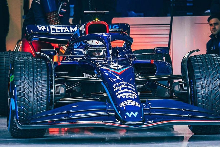
5th: Williams Racing 7.5/10
I gave Williams the same score as Mercedes. I do like it a little bit more because the color palette is much easier on the eye. The mostly blue looks really awesome to me and I love the way the car is designed. It looks much better on track than when it was originally released. The reason that stops this from being an 8 or a 9 is the side pods look a bit bland. It’s similar to Alfa Romeo in this way, but they don’t have a primary sponsor on the side pod. I like the red outline on the airbox, I don’t think I would have a preference if it was left blue or not. The rest of it I think is perfect.
4th: Scuderia Ferrari: 8.5/10
When this livery was first released, I really didn’t like it. I do still agree that the 75 by the shark fin area looks very awkward and could’ve been placed somewhere where it would’ve looked smoother or just got rid of the black around it. The black on the front and rear wings looks really great and the rest of it is really just how a Ferrari is supposed to look, although I’m not a fan of the black numbers, I would make them white and a different font. The side pods are not part of the livery, but I love their radical design, especially compared to the Mercedes, which appears to have no side pods.
3rd: Red Bull Racing: 9/10
Similarly to the Ferrari, when this livery was first released, I didn’t like it. However, they released the show car, like Alpine did, and at testing their car has looked fantastic. It’s the classic Red Bull livery they’ve been using since 2016, which I am a big fan of. The Red Bull also has radical sidepods I love, which make the Oracle logo on them look much more comfortable than it did on the show car. The nose looks much better with much less of the Red Bull logo on it than the show car, which resembled one of their Formula 2 cars. The classic logo on the aribox has been a long time staple of their liveries, and still looks just as amazing. The livery design compared to the shape of the car reminds me of their 2019 car, which is probably my favorite version of this livery.
2nd: Aston Martin F1: 9.5/10
Many people don’t really like the shape of this car, specifically the high nose, but I really like how it looks, especially with its stunning green livery. It’s a simple British racing green with a couple of lime lines and some sponsors on the car. I really like the sponsor placement, and the simplicity of the color palette makes the livery difficult not to be fantastic. The one thing that I don’t like is the way they’ve incorporated their new sponsor, Aramco. The logo placement is fine, but the colors on the rear wing would work better if they were mixed with the flowing light green lines on the side of the car. I did like the pink they had last year from BWT, but the preference is not significant, and BWT have moved to Alpine.
1st: Scuderia AlphaTauri: 10/10
I had mixed feelings about AlphaTauri’s launch, but that was because they didn’t show the car in person and only released renders, but that had nothing to do with the gorgeous livery that was presented before the eyes of the fans. There is absolutely nothing I dislike about this livery, the contrast between the navy and the white is awesome, the name on the side pod and the front wing looks amazing, their new slogan “Fashion Meets Function” is kind of corny but it does look nice where it’s placed on the car. Many people have expressed their dislike of the orange X in the Flexbox logo on the side, but I personally don’t mind it. This is definitely their best livery since they changed their team name from Scuderia Toro Rosso to Scuderia AlphaTauri in 2020. The livery they used from 2017 to 2019 I believe was perfect and was the best livery of the season every time they used it. In my opinion, they haven’t had a bad livery since 2016, and even then, those liveries weren’t awful.